The Branding Trap: Why AI Companies Are Overcomplicating the User Experience
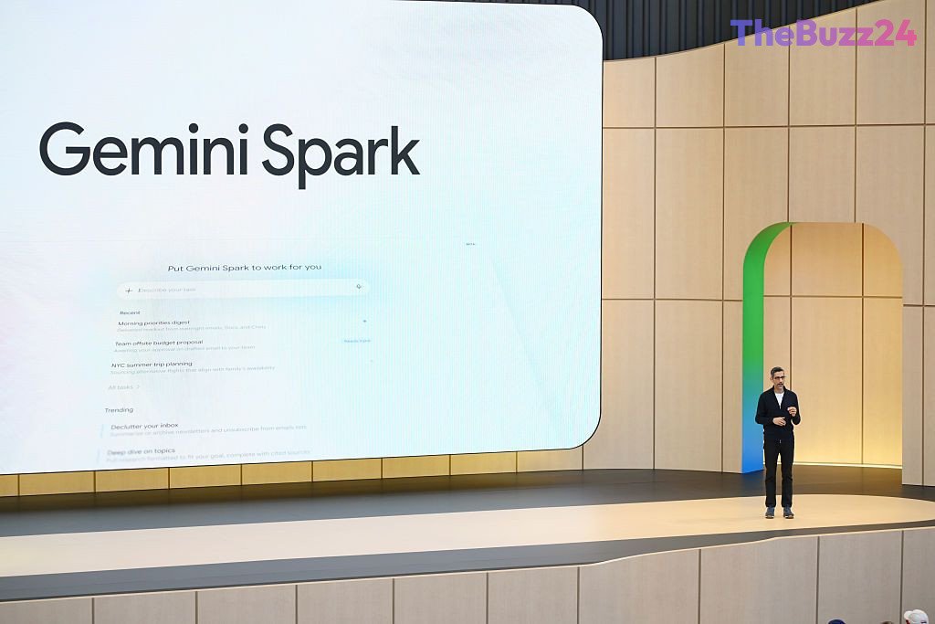
The rapid evolution of artificial intelligence has brought a wave of new features to consumer applications, but a growing trend of fragmented branding is threatening to alienate the very users these tools are meant to serve. Google’s recent updates to its Gemini platform highlight this issue, as the company has introduced a suite of distinct, branded features—such as Spark and Daily Brief—that force users to navigate a cluttered interface rather than enjoying a seamless, unified experience. By exposing the internal architecture of their AI models through specific, named modes, tech giants are inadvertently shifting the cognitive burden onto the consumer.
This design philosophy, which prioritizes internal engineering structures over intuitive interaction, is not unique to Google. Competitors like Anthropic and OpenAI have similarly adopted models that require users to toggle between different modes, such as ‘Chat’ and ‘Work,’ often creating disjointed experiences where context and memory are not shared across the platform. This approach forces users to learn the company’s internal nomenclature rather than simply interacting with an intelligent assistant that understands their intent.
In contrast, the industry is seeing a shift toward more minimalist, text-based interfaces that prioritize simplicity. By treating AI as a contact that can be messaged like a friend, these services remove the friction of navigating complex app menus. Meanwhile, Apple’s strategy of integrating AI capabilities directly into existing, familiar workflows—rather than creating new, branded silos—suggests that the most successful AI implementations will be those that remain invisible, enhancing current habits rather than demanding that users adopt entirely new ones.
Key Takeaways
- Major tech companies are over-branding internal AI features, leading to fragmented and confusing user interfaces.
- The current trend of forcing users to choose between specific 'modes' or 'branded tools' creates unnecessary cognitive friction.
- Simpler, text-based AI interfaces and invisible integration into existing apps are emerging as more effective strategies for consumer adoption.
Editor’s Analysis & Impact
The current state of AI product design reflects a ‘first-mover’ phase where companies are eager to showcase the breadth of their technical capabilities. However, this engineering-first approach is creating a significant barrier to mass-market adoption. As the market matures, the competitive advantage will likely shift from who has the most ‘features’ to who provides the most seamless experience. Companies that continue to force users to navigate complex, branded sub-menus will likely lose ground to competitors that prioritize ‘invisible AI’—tools that integrate into existing workflows without requiring a change in user behavior. The long-term success of AI assistants depends on their ability to act as a unified, intuitive layer over existing digital lives, rather than acting as a destination that requires its own learning curve.
Frequently Asked Questions
Q: Why is branding multiple AI features within one app considered a problem?
A: It creates a cluttered user experience that forces consumers to learn specific terminology and navigate between different modes, rather than allowing the AI to intuitively handle tasks based on the user's request.
Q: How does Apple’s approach to AI differ from companies like Google or OpenAI?
A: Apple focuses on integrating AI capabilities into existing, familiar apps and features, such as Photos or Spotlight, rather than requiring users to learn new, branded interfaces or switch between specific AI 'modes'.
AI Disclosure: This article is based on verified data and official reports. Our Team and AI have cross-referenced every financial detail with primary sources to ensure total accuracy.
More from this Category