Rewriting Global Cartography: The United Nations Pushes for Equal Earth Map
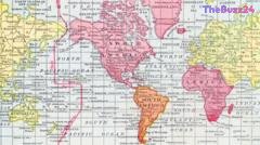
The United Nations General Assembly has officially adopted a groundbreaking resolution known as ‘Correct the Map,’ urging the global community to replace the centuries-old Mercator projection with a more geographically accurate representation. For generations, the standard world map has severely distorted the scale of continents, famously depicting Africa and Greenland as roughly equivalent in size despite Africa actually being roughly 14 times larger. By endorsing the Equal Earth projection, policymakers and cartographers hope to correct these long-standing visual disparities that have historically understated the true geographic footprint of the Global South.
Created in 1569 by Flemish cartographer Gerardus Mercator, the original projection was engineered primarily as a navigational tool for maritime explorers. By stretching grid lines outward near the poles to maintain proper compass angles, the map inadvertently inflated landmasses in northern latitudes while shrinking those near the equator. Although this design excelled at guiding sailors across oceans, its modern ubiquity—found everywhere from classroom walls to digital applications like Google Maps—has drawn sharp criticism. Geographers and cultural analysts argue that continuous reliance on distorted proportions subtly influences public perception, anchoring a subconscious bias that equates physical map size with political, economic, and cultural significance.
The newly favored Equal Earth map, developed in 2018, seeks to restore balance by accurately representing the relative sizes and shapes of global landmasses. While it has already gained strong backing from the African Union and now the United Nations, cartography experts emphasize that flat representations of a spherical globe always require compromise. Unlike the Mercator projection, which preserves navigational angles at the expense of area, the Equal Earth model sacrifices directional precision to ensure scale accuracy. As international institutions transition toward fairer visual standards, the debate highlights the complex challenge of capturing our three-dimensional planet on a two-dimensional plane without reinforcing geopolitical inequalities.
Key Takeaways
- The UN General Assembly adopted the 'Correct to Map' resolution to replace the traditional Mercator projection.
- The Mercator map, designed in 1569 for navigation, severely distorts the size of continents like Africa and Greenland.
- The newly endorsed Equal Earth projection offers a fairer representation of global landmass sizes but lacks navigational utility.
Editor’s Analysis & Impact
The United Nations’ formal endorsement of the Equal Earth projection marks a significant cultural and geopolitical shift in how global data and geography are visualized. For centuries, cartography has quietly reinforced Eurocentric perspectives through subtle visual distortions, particularly minimizing the perceived scale of African and South American nations. While this shift will take time to permeate educational curricula, corporate boardrooms, and digital mapping software, it underscores a growing demand for equity and accuracy in global standards. However, cartographic limitations remain an inescapable reality; flat maps can never simultaneously preserve area, shape, distance, and direction. Consequently, the transition highlights an ongoing education challenge regarding spatial literacy, proving that even our most fundamental visual tools require critical evaluation in a modern, interconnected society.
Frequently Asked Questions
Q: Why does the Mercator map make Africa look small?
A: To represent a sphere on a flat piece of paper, the Mercator map stretches grid lines wider as they move away from the equator toward the poles, making regions near the poles appear much larger and regions near the equator appear smaller.
Q: What are the drawbacks of the Equal Earth map?
A: While the Equal Earth map accurately portrays the relative sizes and areas of landmasses, it sacrifices the straight navigational lines found on the Mercator map and cannot be used to measure true distances and directions.
Q: Why is map projection important beyond navigation?
A: Maps shape how regions are perceived politically, culturally, and economically. Consistently shrinking certain continents can subconsciously lead people to view them as less significant on the global stage.
AI Disclosure: This article is based on verified data and official reports. Our Team and AI have cross-referenced every financial detail with primary sources to ensure total accuracy.
More from this Category